
Facing a consistently high bounce rate is a nightmare for financial professionals. In general, a bounce rate above 70% (except for with blogs) means it’s time to change something within your website.
79% of people will go look for a different site if they don’t like what they find on one.
What’s actually the culprit when it comes to prospects leaving your website? These 7 mistakes are some of the most common, costing you clients and potentially hurting your firm’s reputation. See if any of these apply to your website, and if so, learn how to implement the solutions that will save your website’s appeal.
- Your Design Is Outdated
- Your Content Is Hard to Digest
- Your Structure Is Clunky and Hard to Navigate
- There’s No Personality
- Your USP Isn’t Clear
- There’s No CTA
- Your Pop-Ups Are Overwhelming
1. Your Design Is Outdated
3/4 of people base the credibility of a business on its website’s design. As far as grabbing the attention of prospects, your web design is extremely important. Visitors quickly process whether or not they find the design of your website appealing, and it will undoubtedly affect their opinion on your brand.
One key aspect of this is making sure your site is mobile responsive.
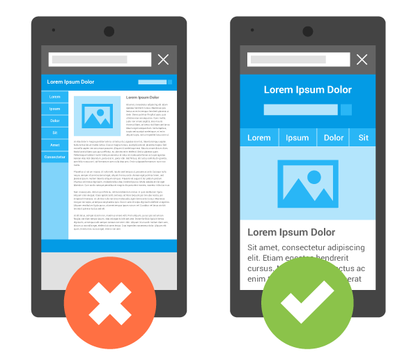
A mobile responsive site will adapt to all technology, providing an enjoyable web experience from any screen. A website that isn’t optimized for mobile is a recipe for disaster if someone tries to access your site from a tablet or smartphone.
The Solution
Revamp your web design using a platform that will not only modernize your site’s look but ensure mobile responsiveness. For example, here at Twenty Over Ten, all the websites within our platform are automatically mobile responsive.
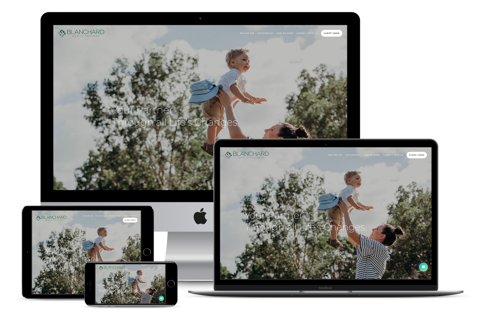
Twenty Over Ten client Blanchard Wealth Partners has a website that’s mobile-friendly across the board.
2. Your Content Is Hard to Digest
While good content and content marketing are vital for digital success, bad content execution can hurt more than it helps. There are 2 big content blunders:
- Poorly Written. Visitors can’t easily understand what you’re trying to say and/or the information isn’t helpful to them.
- Poorly Designed. The font or layout isn’t appealing to look at, making it difficult to read.
The Solution
Ensure that your content is both well-written and well-designed. Use your audience’s language in your website copy and blog posts, and generate client-centric content that functions in a problem-solution format. For your design, use a consistent and professional font theme that’s big enough for prospects to read with ease.
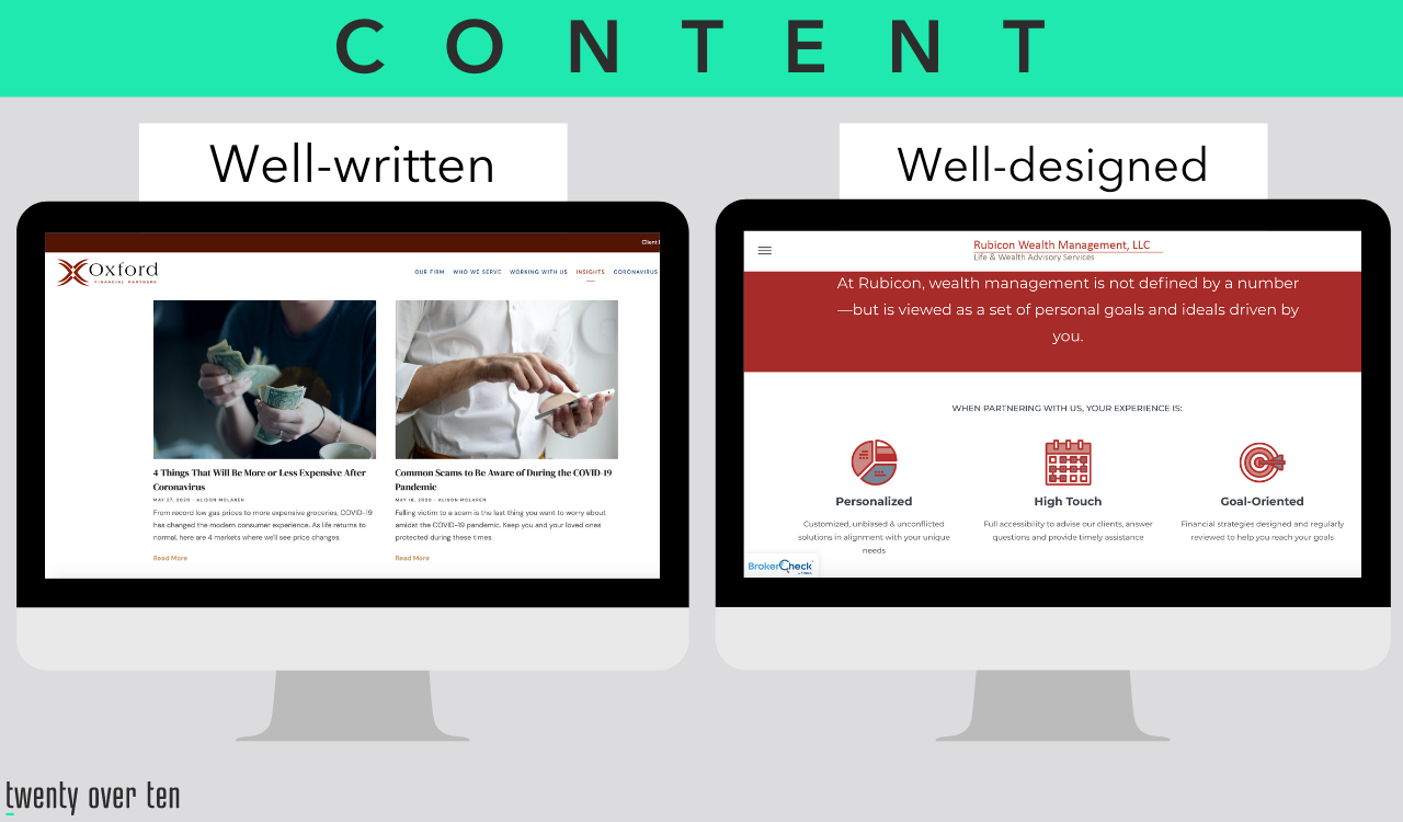
Oxford Financial Partners uses customizable Lead Pilot content to produce helpful audience-specific content that’s easy to read. Rubicon Wealth Management, LLC is a great example of effective design, with strategic contrasts, a large font, and an appealing format.
3. Your Structure Is Clunky and Hard to Navigate
Before the internet underwent rapid advancement to become what it is today, the clunky website was the norm. Website design was a simple compilation of blocks of text and images.
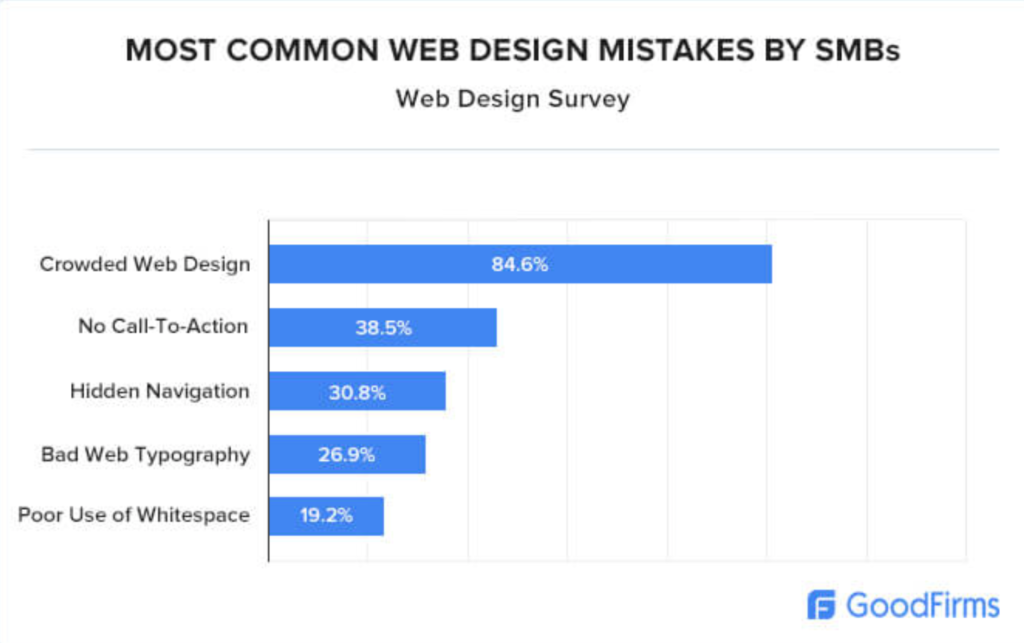
Today, websites have the capacity to be so much more-rather than utilizing clunky organization, websites flow, bettering usability and appearance. Still, the most common web design mistake made by small businesses is crowded web design.
If your website is clunky, it might be hurting your navigation and user experience.
THE Solution
If this is your issue, it’s time for a web design makeover. Prioritize navigable, modern design strategies to create a website that’s more than just blocks on a page.

Sage Wealth Planning’s web design is sleek, modern, and easy to navigate.
4. There’s No Personality
You could have a top-notch web design and still fail to generate leads. Here’s why: if you don’t establish a brand personality, nothing will differentiate you from competitors. 94% of consumers are likely to practice brand loyalty if the brand is transparent. Transparency is synonymous with personality. If your website copy could easily have been written for any other advisor’s website, that’s a sign your brand personality might be lacking.
The Solution
You need to define your brand’s voice: what are your firm’s values? What’s your advising philosophy? What makes your team unique? What’s your story? Once you’ve done that, incorporate it into as much of your website as you can. Visitors should get an immediate feel for your company as soon as they enter the homepage.
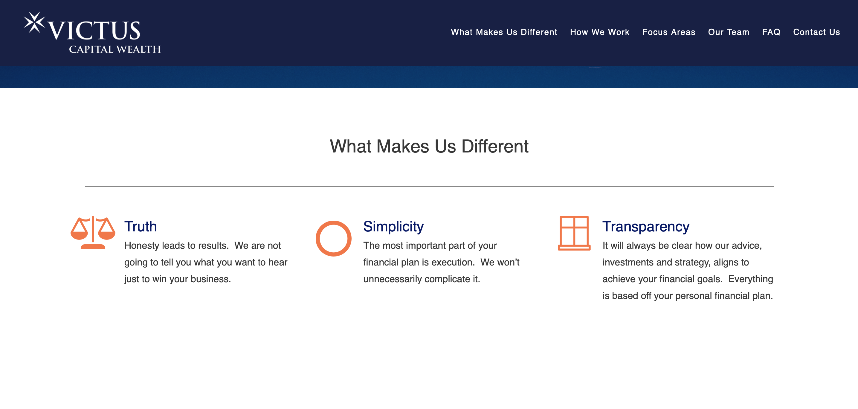
In this example, Victus Capital Wealth clearly articulates the philosophy of their firm by using a distinct voice. By simply reading this copy, visitors get a sense of the firm’s straight forward, tough-love personality.
5. Your USP Isn’t Clear
Every firm needs a well-defined USP, or unique selling proposition. Over 60% of investors can’t tell the difference between multiple advisory firms, largely due to the similar language and generalizations found on many advisor websites. In addition to establishing brand personality, it should be clear what you offer and who you serve on every single page of your website.
If your homepage doesn’t communicate the type of clients you assist and how you help solve their specific problems, you need a stronger USP.
The Solution
Adjust your website copy to be hyper-specific to your audience, and define who exactly that audience is. It’s crucial to find your firm’s niche so that you can express why you’re the best option for that particular niche market. There’s a stark difference between writing “our firm provides comprehensive financial planning” and writing something hyperspecific such as this:

6. There’s No CTA
Sometimes, it’s as simple as this: prospects leave your site because they just don’t know what to do next. 7 out of 10 small businesses do not use a CTA (call-to-action)- and they’re missing out, because CTAs work wonders for conversion rates.
If your website has no easy path to engage with your company other than a contact page, prospects are less likely to take the next steps and more likely to simply leave your page. Having a visible CTA built into your website that’s easy to fill out allows you to establish a connection with prospects and increase the likelihood of turning them into clients.
The Solution
This is one of the simplest solutions: just add a CTA to your website. They can come in many different forms, whether it’s a sign-up for your newsletter or a button to schedule a free consultation. Make sure that you have some type of CTA on every page, because you never know which page a prospect will land on your website from.

7. Your Pop-Ups Are Overwhelming
CTAs are important, but there comes a point where pop-ups hinder the usability of your website rather than encouraging prospects to engage with you. Statistically, the best pop-ups are well-timed, filled with personality, have context, and of course: there aren’t a million of them.
Pop-ups should add value to your website and, in turn, offer something valuable to the prospect. If they can’t navigate your website without being greeted by a pop-up they don’t want to see, they’re going to save themselves the trouble and find a different website.
The Solution
Be intentional about your pop-ups, and remember quality over quantity. Find other ways to incorporate CTAs into your website without making every single one an intrusive pop-up. Try a pop-up tool such as Sumo or Wisepops for pop-ups that fuction intelligently and are well-designed.

TCM Wealth Advisors, a client of Twenty Over Ten, employs a quick pop-up inviting prospects to join their newsletter. This timed pop-up only shows once the prospect has started browsing the website.
Having a user-friendly website is one of the most important things for a business in today’s world, but don’t worry if your website isn’t drawing in as many prospects as you’d like. There’s plenty of time to build and develop your website, and ample tools available to correct all 7 of these common mistakes.
Related: A 7 Step Formula for Financial Advisors to Convert Website Visitors to Booked Meetings