
Written by: Marin Katusa
The S&P 500 has been chugging along for a decade, up nearly 420% since the 2009 financial crisis lows.
You can argue the reasons why – buying fueled by debt, share buybacks and low interest rates among them. Either way, it’s hard to argue against buying the index being the best risk adjusted trade for the last decade.
Savvy (alligator) investors love a good crisis. It creates panic, which creates buying opportunities. The coronavirus is providing us with just that.
Below is a chart which shows the returns of major asset classes since the coronavirus outbreak.
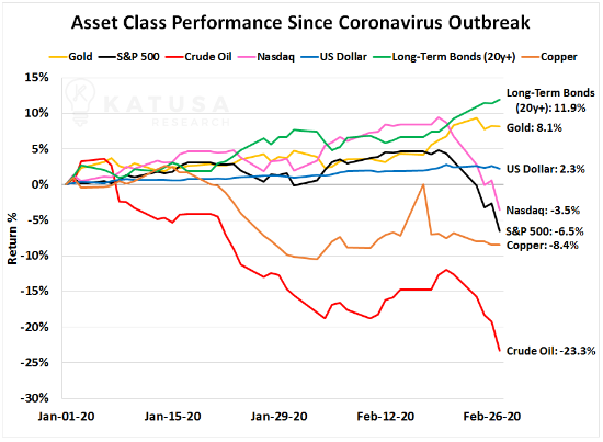
Gurus and doomsdayers alike are pounding the table, saying that the bubble has burst and that coronavirus will topple the world’s economy. It’s a great media soundbite, though a bit excessive. Regardless, it’s created panic and volatility. As a professional investor and fund manager, this is exactly the time I want to be looking to buy best in breed companies.
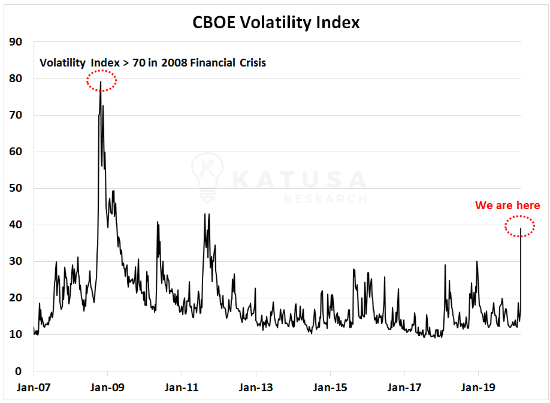
How Do You Measure Stock Market Volatility?
A good measure of volatility is the CBOE Volatility Index. It uses short maturity put and call options to calculate a volatility value. The higher the value, the more volatile the market. You’ll see that in 2008-2009 during the Financial Crisis, the Volatility Index almost hit 80. This week, we hit 39.
During times of crisis and volatility, investors buy assets that are good stores of value. Examples of these are gold, long dated U.S. government bonds and the U.S. Dollar. As investors rush into these assets, prices appreciate. You can see this very clearly in the bond market. As bond prices go up, the yield on the bonds fall. You’ll see in the chart below that the yield on the U.S. 10-year bond has made a new all-time low.
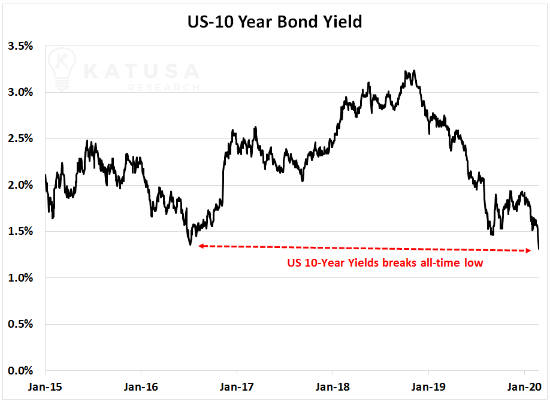
What else does this U.S. 10-year bond chart signal? Expect more negative yielding debt. Low yields incentivize issuers to take on more debt and the debt fueled rally continues.
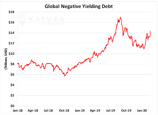
Negative Rates and Debt
Below is an updated chart for global negative yield debt. Currently, there’s $14.3 trillion in negative yield debt.
Monitoring Gold Commitment of Traders (COT) Positioning
What is the Commitment of Traders (COT) Report? The COT report is a weekly update showing the positions of commercial and non-commercial accounts across various commodities. Last week, the Commitment of Traders report showed a massive increase in bullish positioning. Non-commercial long positions soared to a 10-year high.
Below is a chart which shows the non-commercial long position for gold.
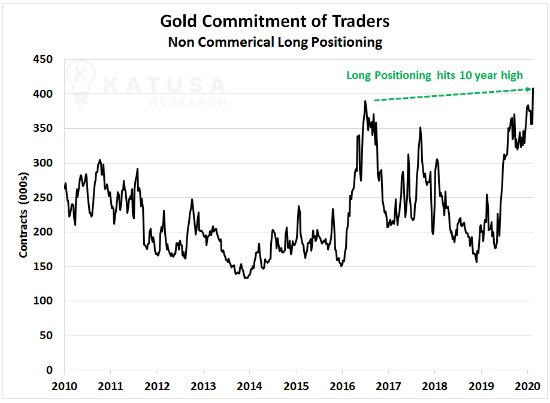
On the heels of this record long position, gold soared to open the week. Gold broke through $1,600 per ounce, reaching as high as $1,690.
I’ve learned many valuable and expensive lessons over my career as a professional investor and fund manager.
My number one lesson: Be patient and always be well capitalized.
I’ve been carefully watching the market, and this week tripled the size of one of my positions. Subscribers had the opportunity to buy at the same price. It was a unique situation and if you weren’t on the ball, you missed it. I think the opportunity was a fantastic risk-reward setup.
Junk Bond Stampede
The U.S. junk bond market just experienced its biggest exodus of capital EVER. We’ve written about this for a long time. A potential re-rating of most corporate credit could happen because of lower growth and earnings expected across the board. I believe this market chaos is going to continue, which will create new opportunities. Over-leveraged “dumb” money will be forced to unload positions and that’s where I excel. Being positioned correctly in times of chaos requires sniper like precision. I’m loaded with cash and ready to deploy it at a moment’s notice.
Related: Prepare For The Crash of 2020?