
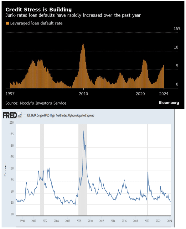
Typically, credit spreads and yields on junk bonds align with credit stress and anticipated stress in the credit markets. Today, however, an aura of complacency reigns over the junk bond market as credit stress for junk-rated companies increases. The top graph, entitled Credit Stress is Building, courtesy of Bloomberg shows that defaults on junk-rated bank loans, aka leveraged loans, have steadily risen since 2022 when the Fed started hiking interest rates. Per data from Moodys, the default rate on leveraged loans is now near 6%, double the 3% average over the last 25+ years.
Despite above-average and rising loan defaults on companies with significant credit risk, B-rated junk bond spreads to Treasuries are at 3.08%, their lowest levels in 15 years. The spread is 2.25% below the average since 1997. So why do junk bond spreads reflect complacency while leveraged loan debt exhibits credit stress? For starters, the supply of junk debt hitting the market has been low as many companies refinanced debt at lower levels in 2000-2021. Second, speculators are chasing risky assets and junk bonds are no exception. Lastly, a Goldilocks economic forecast is commonplace. Accordingly, with no recession in sight, complacency is taking over. The effective yield is around 7.50% on B-rated debt. If the junk bond market experiences similar rising default rates as junk loans, its investors will be in for quite a rude awakening. Until then, party on!
What To Watch
Earnings
Economy
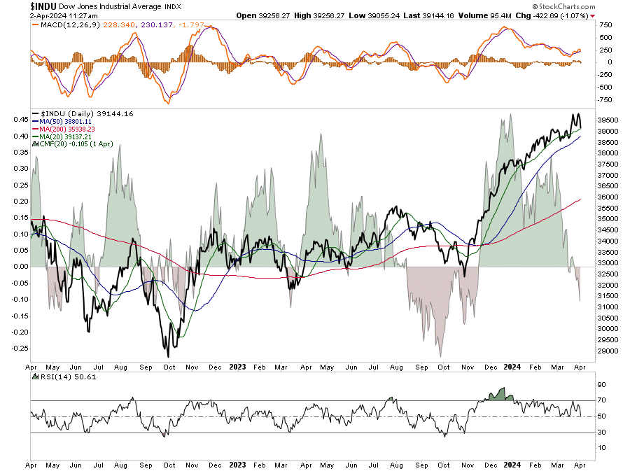
Market Trading Update
In yesterday’s commentary, we noted:
“One day in the new quarter does not mean much, but it remains ripe for further corrective action with the market extended and deviated above long-term means. Also, with the market putting in a double-top, a violation of the 20-DMA will confirm a large correction is in process. There is no reason to be overly concerned with one day’s action, but we watch closely for evidence of a turn. It is worth remembering that the last time we had such a long stretch of overbought condition was in 2017. We then had two sizable corrections in 2018.”
That correction gained some traction yesterday, with the market predictably falling back to support at the 20-DMA. While buyers stepped in at support, there is a rising weakness in the underlying action, which suggests some caution. As shown, the Chaikan Moneyflow Index has turned negative. There is historically a high correlation between the ebbs and flows of the moneyflow index and the market. With the moneyflow index turning negative and the market testing the 20-DMA, we may see the early stages of a larger correction developing. When we get to Friday’s close, we may have our answer if we are below the 20-DMA with some conviction. It is worth noting that we have violated the 20-DMA a couple of times since November. However, each violation was quickly reversed. Such is always the case during a bull run until it ends.
A Technical Take On Oil Prices
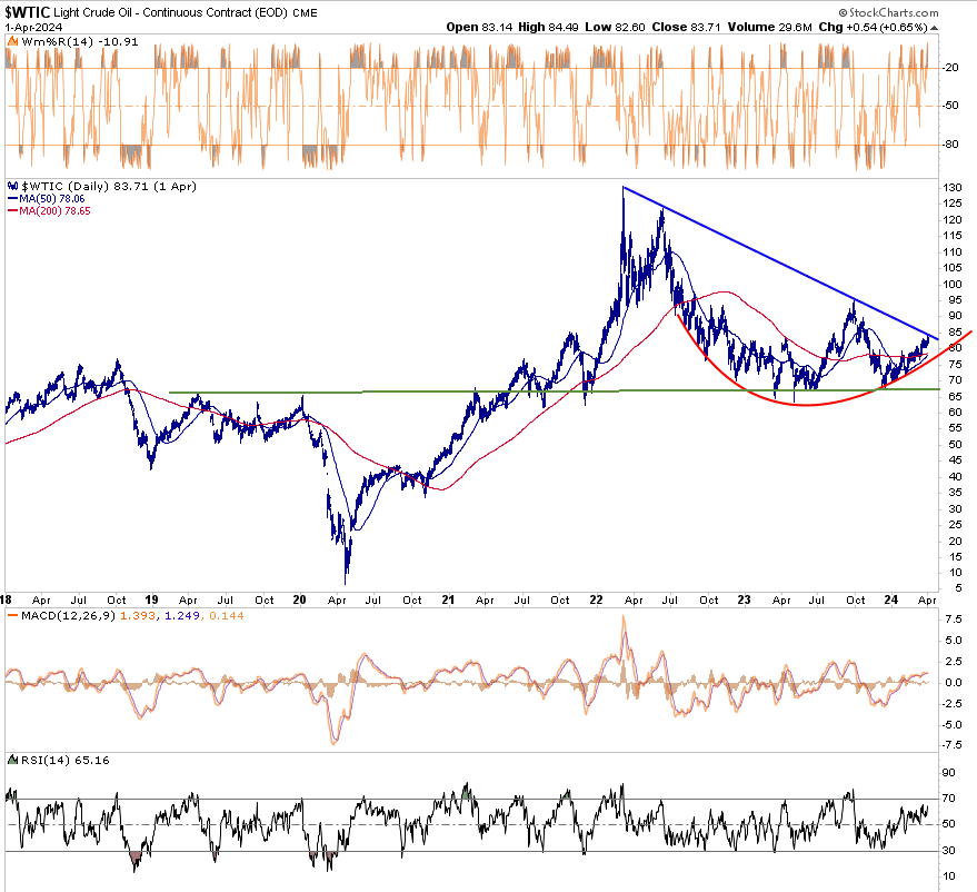
The first graph below is a five-year daily graph of crude oil futures. Of note is that the price has neatly formed an arc. If it continues to follow the pattern, there will be plenty of potential upsides. Also arguing for more gains is a potential golden cross whereby the 50dma crosses above the 200dma. That could occur in the next week. However, the Williams %R and RSI point to short-term overbought conditions. The MACD is bullish but at levels where it could flip to a bearish short-term trade. Most important is the blue diagonal line linking prior peaks. A break above the blue line and the September 2023 peak would signal the potential for crude oil trading at $100 or more. However, a rebuke of the resistance line is quite possible.
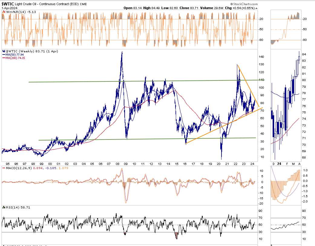
The second graph, which is weekly going back 25 years, shows the longer term price range between $110 and $35. Currently, crude is in the upper end of the range, but it has plenty of room before it gets there. $110 a barrel makes sense if the price breaks out higher from the large orange triangle. While the short-term graph highlights the golden cross possibility, the longer-term graph has a death cross in the making. The price may consolidate in the orange triangle for another month or two before breaking out. A break out above or below the orange lines and above or below the prior peak and trough would likely signal a longer trend. Our more significant concern would come if it breaks below the orange support line, which has proven valuable since 2016. It would likely take a recession to break below the line.
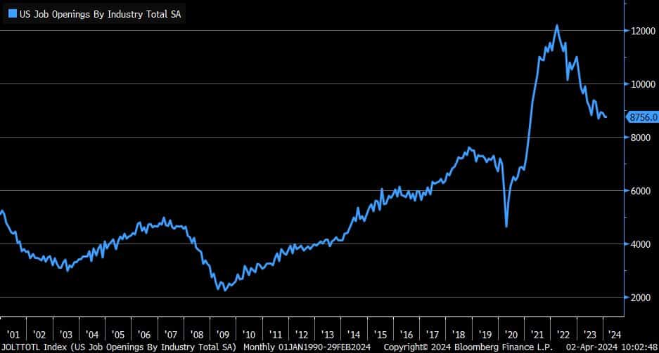
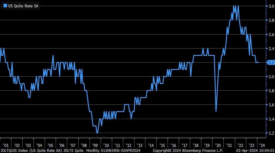
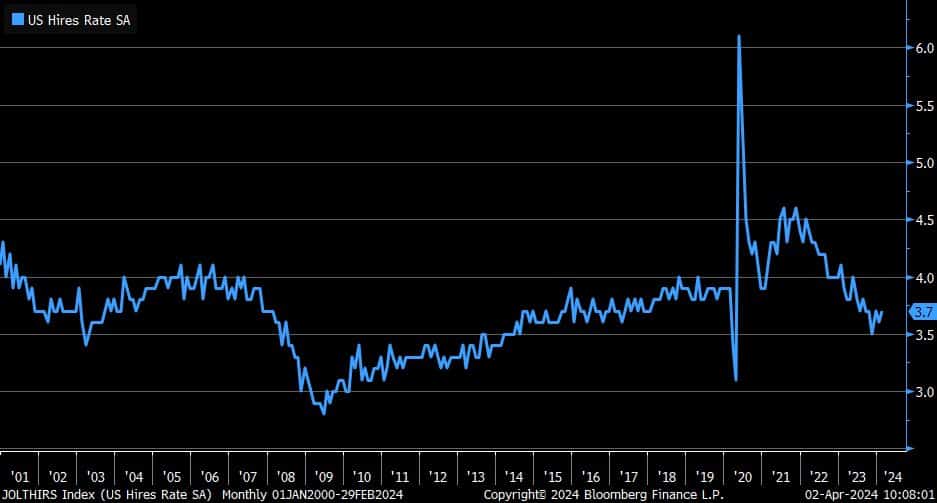
JOLTs Jobs Data “Little Changed”
The JOLTs jobs report was largely as expected and in line with the prior report. In fact, the BLS summary of the report includes the phrase “changed little” five times and “little changed” 4 times. The number of job openings was 8.756 million up slightly from 8.748 last month. However, the number from last month was revised lower by over 100k jobs. We have seen similar lower revisions consistently in the BLS jobs report. The three graphs below show the trends toward a normalization of the labor force is in tact.
Unlike the BLS and ADP reports, JOLTs is released on a two month delay. Therefore yesterday’s was for February. Given its somewhat stale and little changed we doubt the report will impact expectations for Friday’s BLS report.
Tweet of the Day
“Want to have better long-term success in managing your portfolio? Here are our 15-trading rules for managing market risks.”