
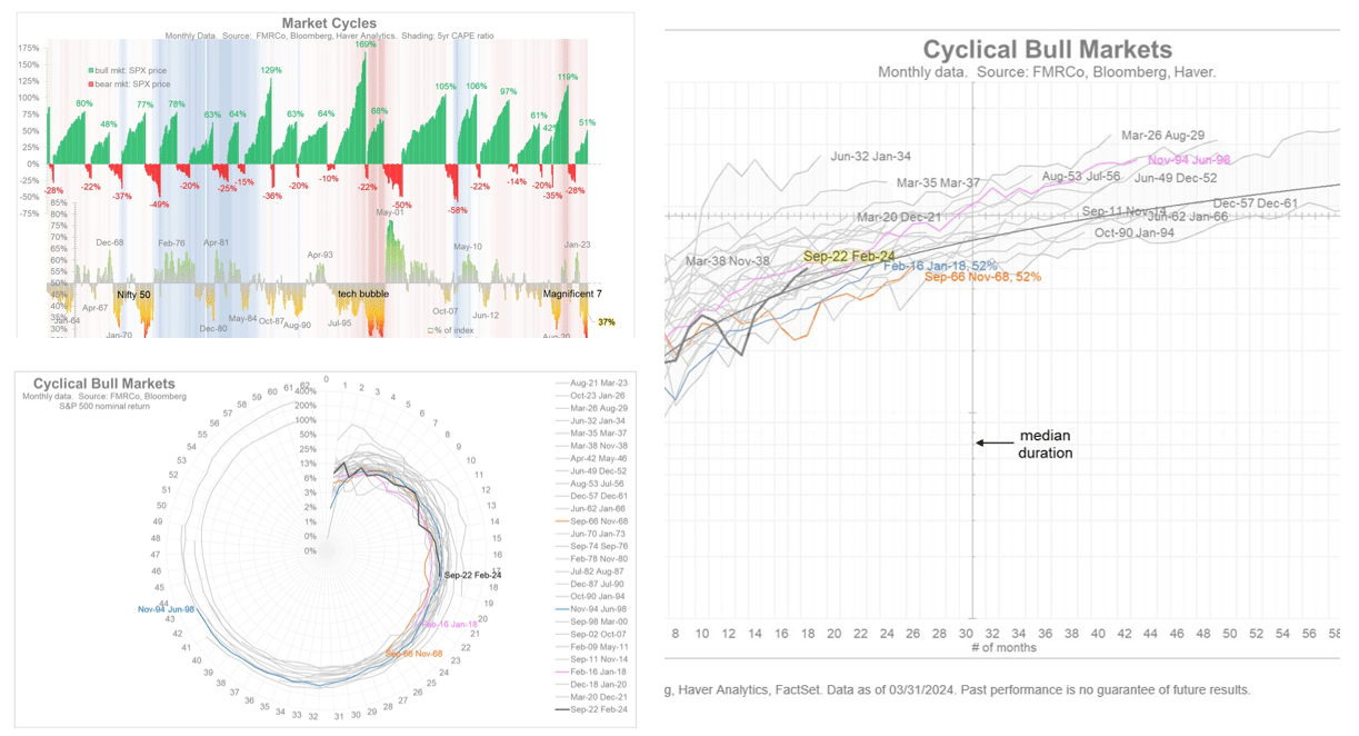
Jurrien Timmer, Director of Global Macro at Fidelity, asks- “What time is it in the cycle? Now that we are 17 months into a bull market cycle, it’s worth asking how much life there is left. How long can this broadening bull continue?” To help assess how much time may be left, Jurrien shares a unique graphical perspective on how the current bullish cycle, which started September 2022, compares to prior cycles. The graph on the upper left shows the 18 bullish cycles since 1960. Currently, with a 51% gain, this bull market cycles has only elapsed two other cycles. The average gain, not including the current one, is 84%. This clock tells us there is plenty of upside left in this cycle.
The second spiral chart resembles a clock. The “hands” of the clock measure time in months and the scale within the hands path shows performance. Based on this clock the time is only 3 pm. Most bullish cycles make it past 6 pm and two went all the way to midnight. His graph on the right is similar to the clock but it is in a more traditional format. This graph shows the median duration of bull market cycles is 30 months. Additionally, the current performance is relatively in line with prior bull market cycles. Jurrien sums up his analysis: “Time is still on our side.”
What To Watch
Earnings
Economy
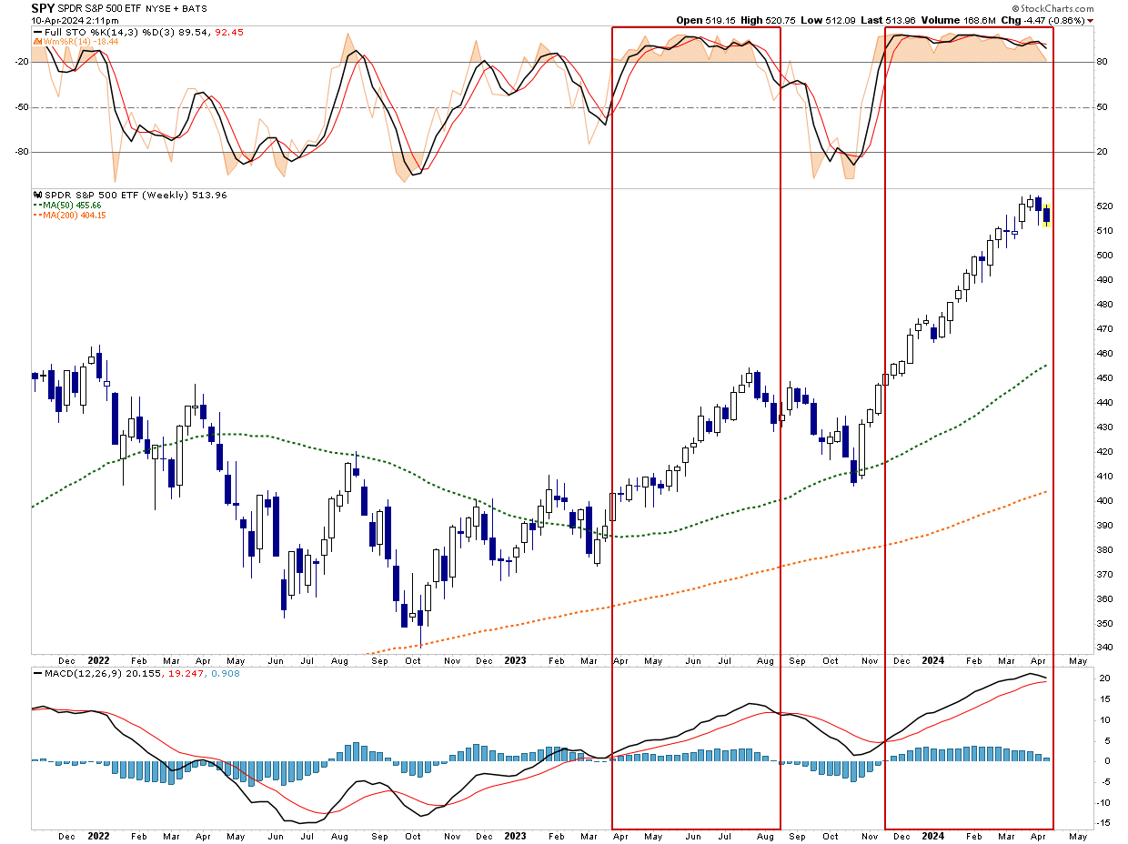
Market Trading Update
As noted yesterday, yesterday’s hotter-than-expected inflation report did indeed add a “layer of risk to market dynamics.” After recovering the 20-DMA running support line on Friday and holding it through Tuesday’s early sell-off, that support again gave way yesterday. While that running support line has found buyers recently, the market has sent a warning sign that buyers are becoming more sparse.
In early 2023, we saw a similar rally in the market as the “A.I.” chase gained traction. Then, like today, bullish sentiment was elevated, investor allocations to equities were high, and technical indicators remained stuck in overbought conditions. As shown, in July last year, the market declined for 3-weeks straight before providing a reflexive bounce to sell into. That bit of breathing room provided an exit before the next leg of the decline through October.
We are currently in the second week of decline and have not triggered “sell signals” just yet. I suspect that will happen sooner rather than later. As such, investors have an opportunity to rebalance risks now. If the market provides a reflexive rally with a sell signal intact, further reductions can be made to offset the next leg of the correction. If the market turns back up and takes out the recent high from last week, then the bullish trend remains intact. Such is why we continue to suggest moving slowly and letting the market dictate the course of action needed in your personal portfolios.
Nonetheless, the market is waking up and it is time to start paying closer attention.
CPI Runs Hot Again
Tuesday’s Commentary shared State Streets analysis calling for 50bps of rate cuts in June. After yesterday’s CPI data, that now seems all but impossible. Both headline and core CPI were 0.1% above expectations at 0.4%. The year-over-year core CPI is 3.8%, in line with the previous month’s reading. This is the fourth month in a row with higher prices than expected. Like the last few months, shelter prices remain sticky, contributing to 40% of the total. When CPI shelter prices catch up to market shelter prices, CPI should decline significantly.
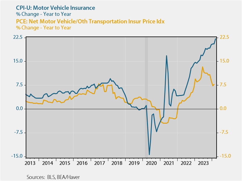
This month, a 2.6% jump in motor vehicle insurance was also seen in March. Despite airfares falling in price by 7.1% over the last year, transportation services are up 10.7%, largely driven by a 22.2% annual gain in vehicle insurance prices. CPI is levelling off and possibly upticking. However, we still believe the data is temporarily too high due to delayed shelter data and other miscellaneous data, like auto insurance, that is seasonal and potentially flawed. For example, PCE, which is the Fed’s preferred inflation gauge, uses a different source for motor vehicle insurance that’s been running much cooler, per the graph below.
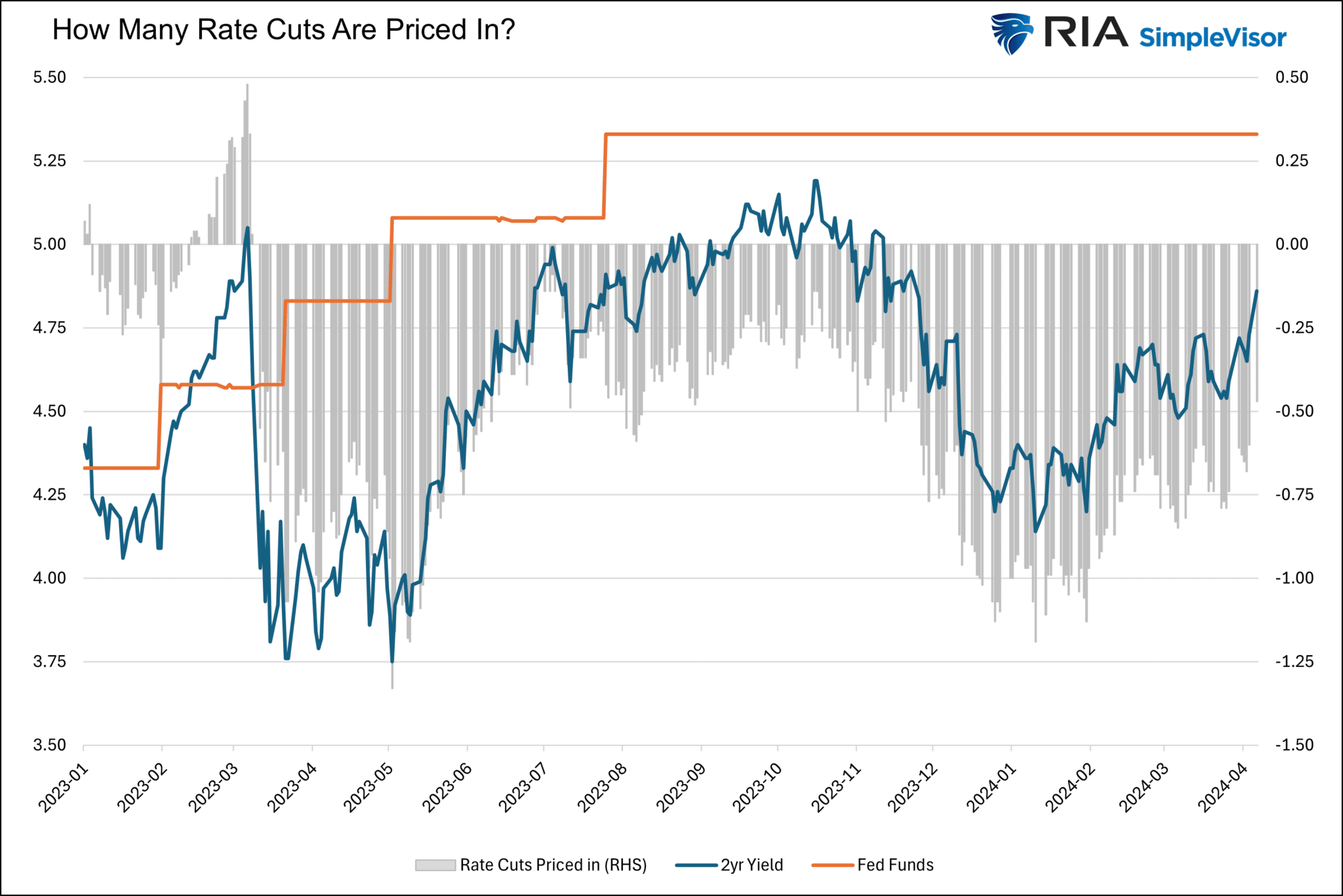
The Fed Funds futures market now only implies two rate cuts, starting in September, for 2024. The graph below compares the two year U.S. Treasury yield to Fed Funds. The difference (gray bars) is the amount of rate cuts the market expects over the next two years on a time weighted basis. As it shows, the year started at 1.25% in interest rate cuts but it has receeded to slightly less than 50bps.
Inconsistency Beneath The Robust Jobs Market Data
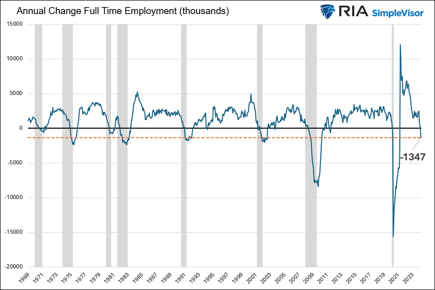
As we have noted numerous times, recent economic data paints a robust picture. However, beneath the surface lies troubling data. For instance, the graph below shows that the economy has shed 1.347 million full-time workers over the last year. Since 1969, the annual change in full-time employment has declined in every recession. Further, other than two minimal declines occurring during the recovery from a recession, the indicator has never been negative. The dotted orange line shows the current level is on par with prior levels that existed toward the end of recessions. In all the prior cases, the change in the number of full-time jobs was positive when the recession started.
The flip side of this discussion is an increase in the number of part-time workers. 1.888 million new part-time jobs have been created in the last year, the fourth-highest annual number since 1969. One should ask why, if the economy is as strong as the data say and the jobs market is still tight, is there a major shift from full-time to part-time?
Tweet of the Day
“Want to have better long-term success in managing your portfolio? Here are our 15-trading rules for managing market risks.”